Victoria KortsenshteynXIdo Vadavker
Design Reveal·2026
The Goal.
Turn a Google search into a booked session, in Hebrew or English, with the depth and the care felt before she ever arrives.
Bilingual, Hebrew-first
Booking always one tap away
Grounded depth, never clinical
Victoria KortsenshteynXIdo Vadavker
Design Reveal·2026
The Process.
01
We listened
It started with discovery: your story, your clients, and the sites you love. Nothing here is a guess.
02
Found the words
Treatment names, prices and your story, written and translated so Hebrew leads and English follows cleanly.
03
Set the direction
A feeling you signed off on: warm, calm and grounded, type as the hero. Locked before a page was drawn.
04
Built in code
No static mockup. Hand-built in the browser, so what you see is the real thing, fast from the first second.
Victoria KortsenshteynXIdo Vadavker
Design Reveal·2026
A word before you scroll
It's quiet on purpose.
A first look at something this calm can feel almost empty for a second. That's the restraint doing its job, the same rest your treatment gives. It settles the longer you sit with it, and even more once it's live in your world.
Victoria KortsenshteynXIdo Vadavker
Design Reveal·2026
01
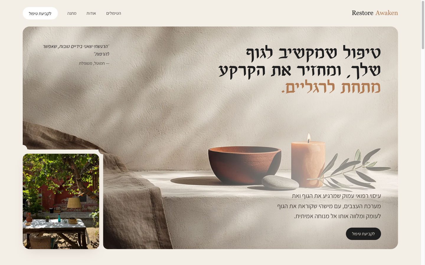
Home
The whole journey on one page. It leads with the promise, proves the depth and the hosting, answers the real fears, and keeps a book button in reach the whole way down. Hebrew and English share one layout, so neither feels like a translation.
Victoria KortsenshteynXIdo Vadavker
Design Reveal·2026
02
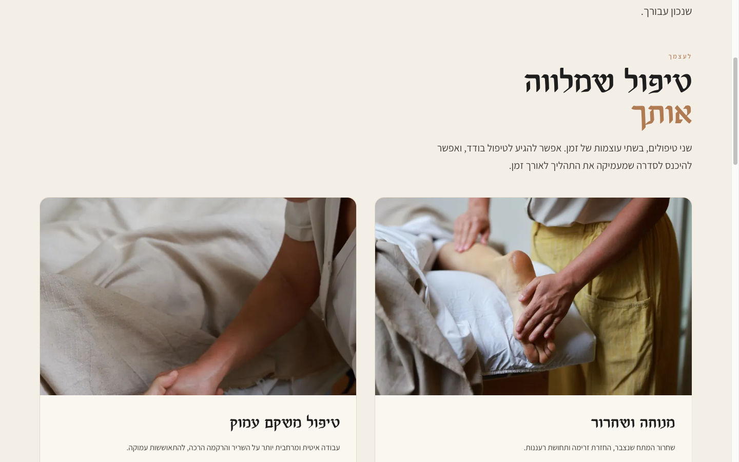
Treatments & Booking
Every treatment gets room to breathe: a plain-language description, an honest price, and a book button right there. No PDFs, no guessing. This is the page that turns a browser into a booking.
Victoria KortsenshteynXIdo Vadavker
Design Reveal·2026
03
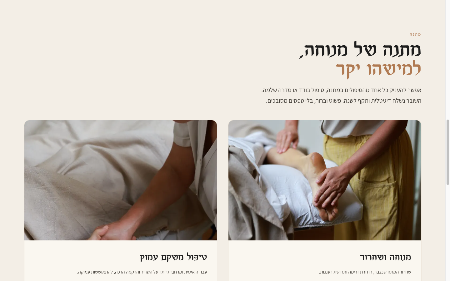
Gift a Session
A calm, shareable page for buying a treatment as a gift. No popup, no friction, a real link you can send. The confusing checkout is gone.
Victoria KortsenshteynXIdo Vadavker
Design Reveal·2026
On Brief.
Found on Google
When someone searches for medical massage in Jerusalem, you're the one they find.
Calm, fast, premium
A site that loads instantly and feels as calming as your treatments.
Books while you sleep
A booking and gift-card flow built to convert, so you wake up to new reservations.
Victoria KortsenshteynXIdo Vadavker
Design Reveal·2026
Where This Could Go.
Hebrew SEO engine
A steady stream of treatment and wellness articles in Hebrew to own the Jerusalem search results over time.
Booking automation
Reminders, follow-ups, and rebooking nudges so your calendar fills itself.
Gift-card season
A seasonal gifting push around the holidays, the highest-margin bookings you can make.
Victoria KortsenshteynXIdo Vadavker
Design Reveal·2026
Next Steps.
Sit with it
Watch it, then take a day. However's easiest after that — a quick message or voice note for small things, or a short call for anything you'd rather talk through. No need to write it all out; I'll send a summary of the changes after.
Two rounds to refine
This phase includes two rounds of changes. We tune tone, weight and detail until it's right, then I build out the full site.
Keep the folder flowing
The more real photos and words you drop in, the closer the final site is to the real thing. The folder stays open the whole way.
Victoria KortsenshteynXIdo Vadavker
Design Reveal·2026